This post may have outdated information. Originally written 09/28/2012


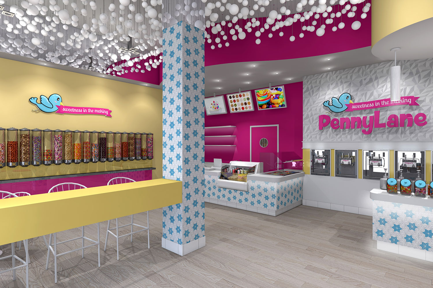
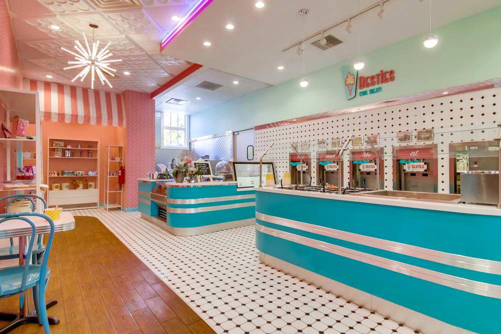
The design of a frozen yogurt store is almost as important as what is served up. These stores are as trendy and fashionable as coffee shops were a decade ago, and they should reflect this in their design and layout. Design should be secondary only to health standards and efficiency in serving, because a good design will attract business and keep bringing people back to show their friends.
One of the most common design elements shared by successful frozen yogurt shops is that all the additional ingredients are displayed in an interesting and enticing way. They should be protected by sneeze guards, but each can be shown in its own unique container with interesting names and labels or even lit by LEDs. Even spoons and napkins can be displayed uniquely in different containers in one spot or throughout the store to reduce crushes of people.
The size of the shop will have a large say in determining the style and layout. Very small stores may wish to add decorative mirrors that will make the space seem larger, while narrow stores may need to have the serving counter opposite all of the seating instead of at the back. There needs to be a clear walkway for people in line, as well. There should be ample seating to allow large numbers of customers to sit and eat, but the seating itself needs to be sturdy and trendy to compete with other shops. Many shops use the same seating, but using a wide variety of different chairs or fabrics can be eye-catching and conversation pieces. Tables and counters can also be decorated or left bare to fit the seating decor.


Color choices for the walls, ceiling and artworks will make a bold statement and can draw people in from the sidewalk. Bright wall colors are in vogue, but subdued colors with a few bright accent pieces can be just as striking. These colors can be coordinated with business cards and advertisements to brand them for more effective marketing.
Frozen Yogurt Store Floor Plans Video:
Below is one of our own videos, going over two different floor plans of real live soft serve stores! One is a store that has yet to open, while the other is a store that is open and operational today!

